

Correlation Matrix
The intersection of a row with a column outputs the respective correlation coefficient of the two values to each other.
The correlation coefficient is 100 if the same symbol is selected in the column and row.


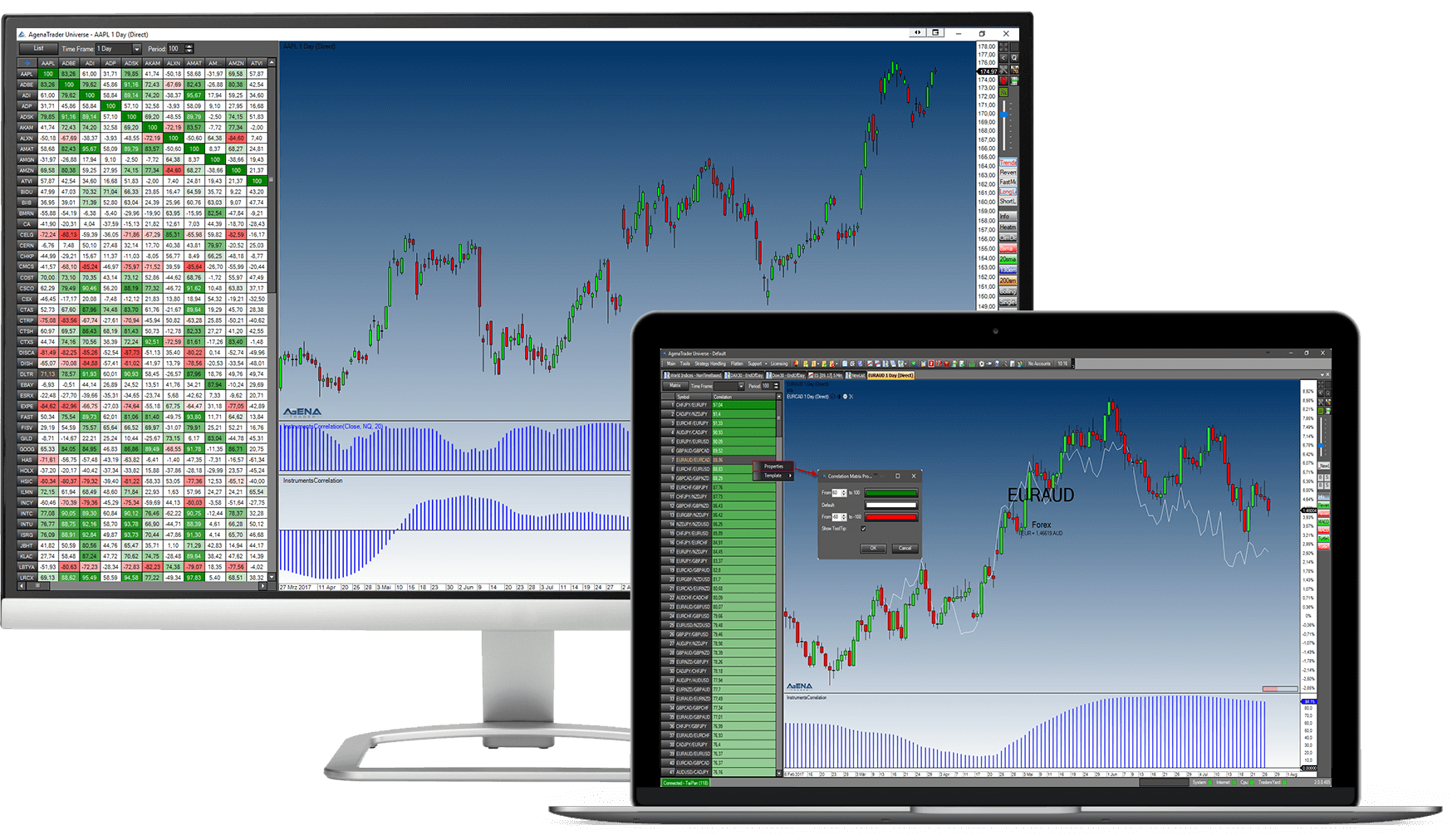
With the correlation matrix, you can compare the performance of individual instruments and even entire instrument lists in real-time (!) in any given timeframe. The correlation matrix can be filled with all the instruments you wish; you can even compare instruments from various asset classes with each other. The correlation coefficient is calculated in real-time, and extreme values are automatically highlighted in color.
The module also includes a chart in which the two symbols that you have selected in the matrix or the list are automatically loaded – the main symbol as a normal chart, the second instrument as a “second data series” as a line chart. In addition, the InstrumentCorrelation indicator is displayed, which shows the development of the correlation of these two values to each other over time.
The intersection of a row with a column outputs the respective correlation coefficient of the two values to each other.
The correlation coefficient is 100 if the same symbol is selected in the column and row.
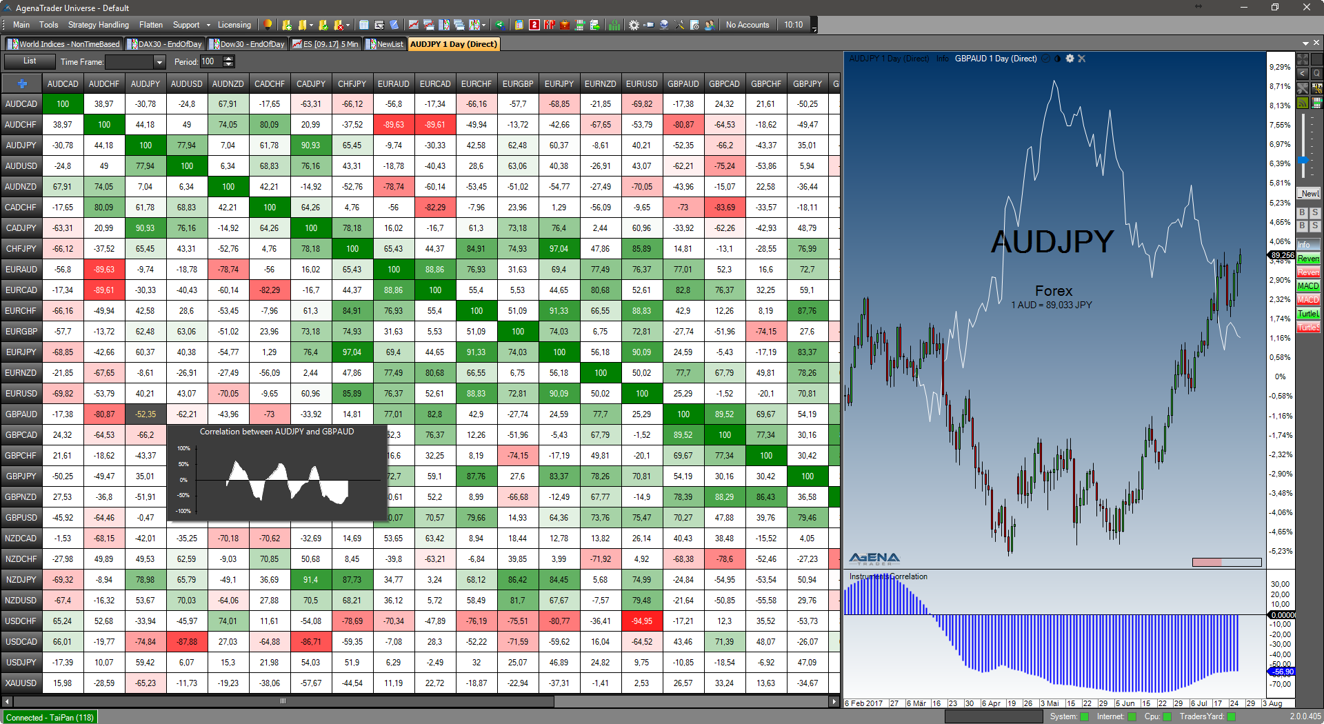
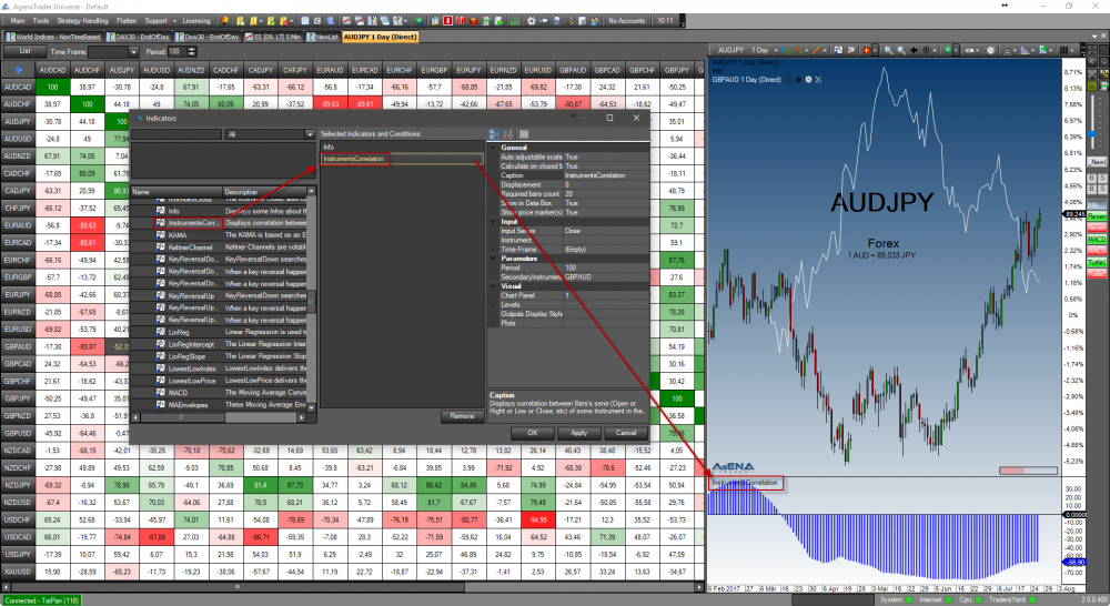
For the display, the “InstrumentsCorrelation” indicator is used, which is also loaded into the chart to the right of the matrix by default.
This indicator calculates the historical correlation coefficient for every historical period and depicts it graphically.
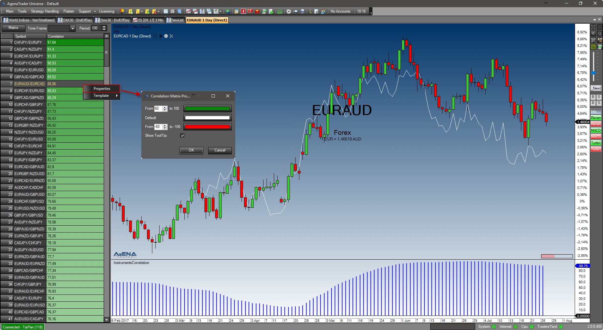
By right-clicking in the matrix or the list, you can call up the correlation-specific display settings.
You can set the values from which the cells should begin to be colored, and also the colors that should be used for a value of +100 and -100.